Follow Us


 For this week’s Evolution of a Cover, we spoke with Rebecca Lown about the process of pinning down the perfect cover for Michele Weldon’s memoir, Escape Points.
Cover designing is never an easy process, but sometimes our designers are presented with an extra-challenging task. How do you convey single mother, high school wrestling, career woman, and breast cancer all on one cover?
The answer? It’s not easy. It was hard to come up with a cover that could integrate each concept.
The direction given was to focus on wrestling as the main theme. The requirements for the cover were: literary with a sense of humor and warmth and the key colors of blue and orange—the colors for the high school that Weldon’s sons attended.
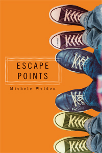
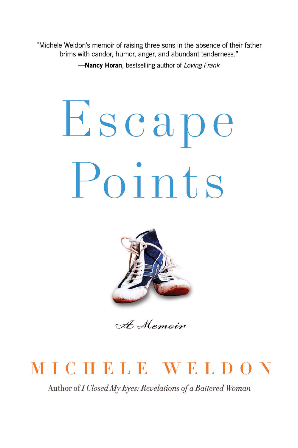
Anne Lamott’s Traveling Mercies and Hakuri Murakami’s What I Talk About When I Talk About Running were cited as covers to look at for inspiration. You can see in one of these early drafts I went directly for the Traveling Mercies look, but the result was too sterile and lacked the emotional connection we were going for. The playful cover with the three pairs of shoes brought the family element of the story into focus, but it lost the wrestling theme. Without some reference to wrestling the title didn’t make as much sense; it could even come across as fiction.
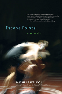
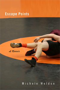
I went with a more straightforward approach, focusing on wrestling for the central image. During my photo research I realized there was something really beautiful about the sport—it has this really brutal physicality but also beauty and elegance. And there were two images that really caught my eye. The first image, the blurred photo of the two wrestlers, was visually arresting, and I felt the movement of the two bodies paralleled Weldon’s struggle as a mom. For the second image, I purposely cropped the photo so the two figures were abstract. I felt it was both beautiful and intriguing, and it played up the orange-and-blue color scheme. For a while, this cover was the front-runner.
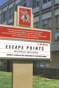
Then CRP received feedback from both bookstore buyers and sales reps that the cover definitely conveyed the wrestling part of the memoir, but the other aspects of the story were lost. So we decided to go a different route, focusing on the key idea of a mother-led single-parent home. I sought out images that connoted warmth, but nothing came together.
So finally, I returned to the earlier covers and tried to play up the more feminine elements but still include an element of wrestling.
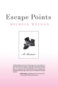
For the first one, I incorporated a pair of wrestling shoes, but they were in black and white — too dark and depressing.
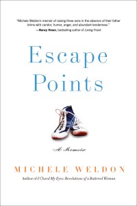
So I tried a pair of wrestling shoes in color. I silhouetted the image, gave it a soft shadow, and placed it in the middle of the cover, almost like a charm on a charm bracelet. With the pink background, the effect was almost too light.
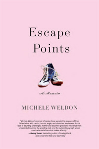
Then, I set the type in orange and blue and gave the cover a lot of white space to let the image breathe, and it was just right.
The final cover is positive and hopeful, and it conveys wrestling as well as a feminine touch. It successfully integrates the book’s themes into one cohesive cover.
Escape Points by Michele Weldon officially pubbed on September 1, 2015. It is available to purchase everywhere books (and e-books) are sold, including our website. For a more in-depth discussion of Michele Weldon’s writing process, check out our Q&A with Weldon and this profile in the Chicago Tribune.
No Comments
No comments yet.