Follow Us


“Evolution of a Cover” offers readers a look at the progression of a cover—from the initial idea to the final cover—by hearing from the designers themselves.
For this inaugural post, Marc Whitaker of MTWdesign talks about the process of creating the cover for Tracey Goessel’s upcoming biography of Douglas Fairbanks, The First King of Hollywood, available October 2015.

This project came about fairly easily. The book’s author is very involved in silent film preservation and silent film history (especially related to Douglas Fairbanks), and has a collection of items related to silent film, and so Chicago Review Press was able to provide a wealth of background information about, and photos of, Fairbanks and his movies at the very beginning of the cover process.
The main idea I had for this cover was to make it fit the era—somewhere around 1925—but still have a hint of a modern feel to it. I researched movie poster art from this time period and familiarized myself with the typography and colors that were popular at that time. While the main image for the cover is important, getting the typography right was more important. It’s so recognizable and helps the reader make that immediate connection. I feel that the typography was really the key to all of the covers.
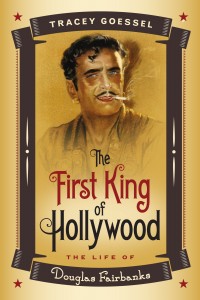
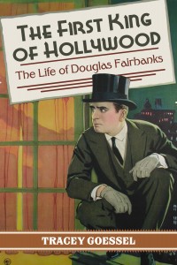
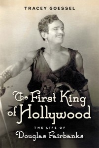
 These first two covers were designed specifically with the movie poster look in mind. For the yellow option, I combined the photo of Douglas with illustrative type borders and fonts that were similar to the feel of a 1920s or 1930s movie poster. The second speaks for itself—Fairbanks was the first swashbuckler film star and there had to be a cover that captured that sense of adventure.
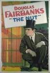
One of the images that the author provided was the poster for Fairbanks’s film, The Nut, and it was suggested that the text from the movie get swapped out for the book’s title and subtitle. It’s a striking cover, but in the end it was deemed too simple and not original enough.
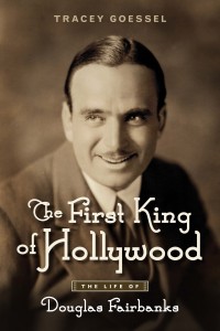
To offer a different option from the movie poster designs, and because it was a really great picture, I tried this photo of Douglas looking to the left. Most of the photos that were available of him, because of age, would require a great deal of retouching to get rid of dust and scratches from the original, but this one didn’t require that attention. It’s very well preserved and the look, that expression on his face, was so different from most of his head shots we thought we would throw it in the mix.
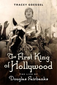

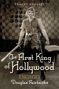
We pretty much nailed the era with the typography we used on the first round of covers. The focus of the revisions was finding the right photo—one that people would recognize, and what would catch people’s attention first. Since one of Fairbanks’s biggest roles was Robin Hood (and even if you aren’t familiar with Fairbanks, almost everyone knows the character), that pushed us in direction for photography choice. The final image captures the adventure as well as the wit that Fairbanks embodied.
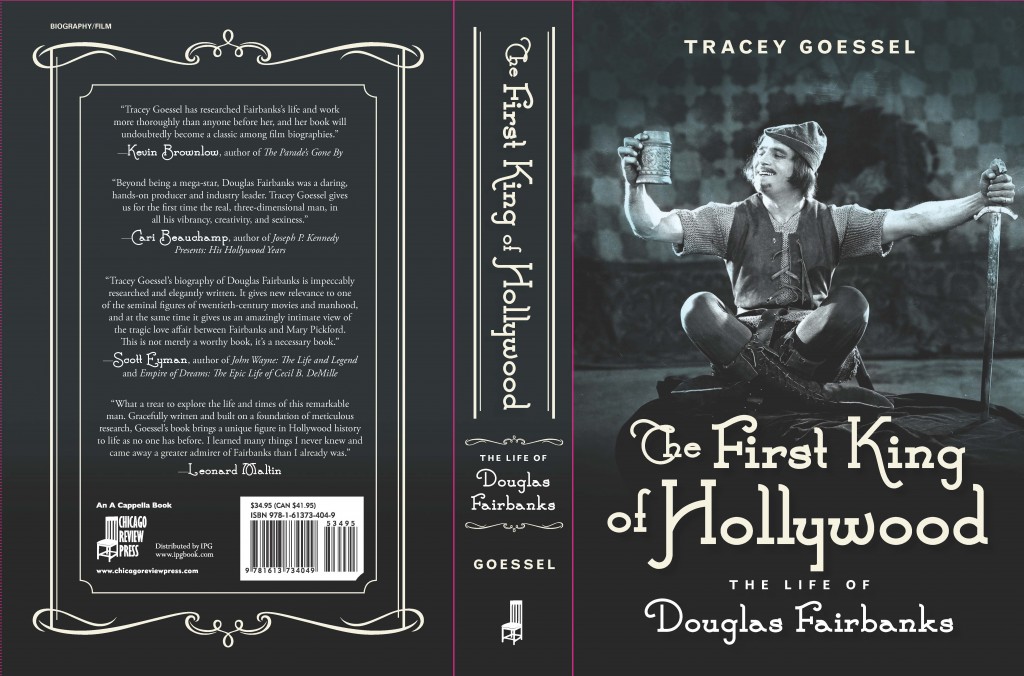
Once we agreed on the photo, I carried that 1920s–era look over to the back cover by using a simple but ornate border that was consistent with what was used during that time period.
The First King of Hollywood: The Life of Douglas Fairbanks by Tracey Goessel officially pubs on October 1, 2015. It is available to purchase everywhere books (and e-Books) are sold, including our website.
1 Comment
[…] Check out our previous post Evolution of a Cover: The First King of Hollywood. […]