Follow Us


Covers are designed individually, book-by-book, but sometimes we ask our designers not only to design a book cover, but to envision what a potential series of books will look like. It’s that first cover that sets the tone that the rest of the series will follow.
We asked cover designer Andrew Brozyna about his process for creating the covers for our Junk Drawer series (Junk Drawer Physics and Junk Drawer Chemistry, available now).
You’ve designed covers for both Chicago Review Press’s adult list (including Eating Appalachia and Off the Beaten Page) as well as numerous covers for the children’s list, most recently the Junk Drawer Science series. Where do you begin when you’re presented with a children’s book to create a cover for?
I enjoy working on children’s activity books. My philosophy is that they should look fun enough to appeal to a kid but shouldn’t be visually overwhelming with wacky graphics. I want my book design to avoid becoming the Poochie of the children’s bookshelf (that “in your face” cartoon dog in episode 167 of The Simpsons).
One of my first steps was to browse the fonts at blambot.com, a font website that caters to comic book publishers. Naturally, their fun fonts work well for kids’ books too.
What kind of designs did you come up with initially?
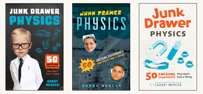
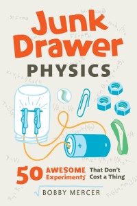
I thought it would be amusing if a brainy kid were shown as a professor with some junk drawer items drawn on the chalkboard. For variety, I wanted to offer a more layered Photoshop collage of kid scientists and a laboratory background. My third design focused not so much on the kid, but on the items that are used in the physics activities. It was this approach that resonated with editorial and marketing.
 What changed in the next go-round?
In the second round we adjusted the kinds of items that would appear on the cover. The DIY light bulb has more energy to it (pun intended). In the first round I used an image of physics charts that I found online, but in round two I wrote out my own equations. The author helped in making sure these were accurate! Even though they are a small background element, I always like things like that to be authentic.
So you design and illustrate? How does that work?
The illustrations themselves were a combination of low-tech and high-tech. The author’s photos of his activities were my reference. I made drawings with markers, scanned them in the computer, made them bitmap files, and finally assembled and colored them in InDesign.
How did this design provide a successful series look?
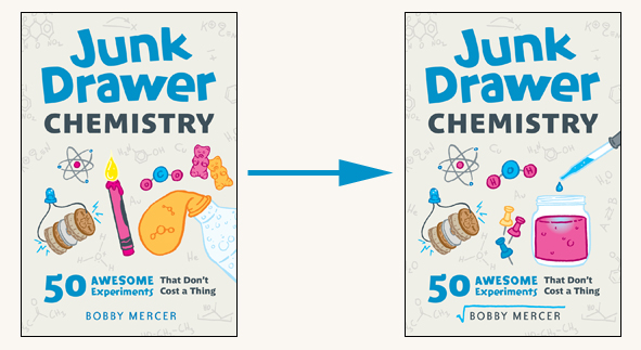
When Bobby Mercer’s next book in the series came along we had the loose design template to work with. I used the same font for the title, Junk Drawer Chemistry, but changed the color to blue. A pattern of chemistry equations and molecules decorate the background. Again, the items depicted on the cover come from activities found in the book.
Was the process for the second book in the series much more straight forward?
I knew that crayon candle would be an eye-catching image, but it didn’t fly with marketing. I’m guessing that some parents would be hesitant to buy their child a book that encourages them to make small fires. So, we swapped that out for a jar of a colorful chemical reaction.
No Comments
No comments yet.