Follow Us


Introducing our new Publishing Industry Insider blog series! Every few months, these interviews will reveal the individuals working behind the scenes who help shape our books into the final product.
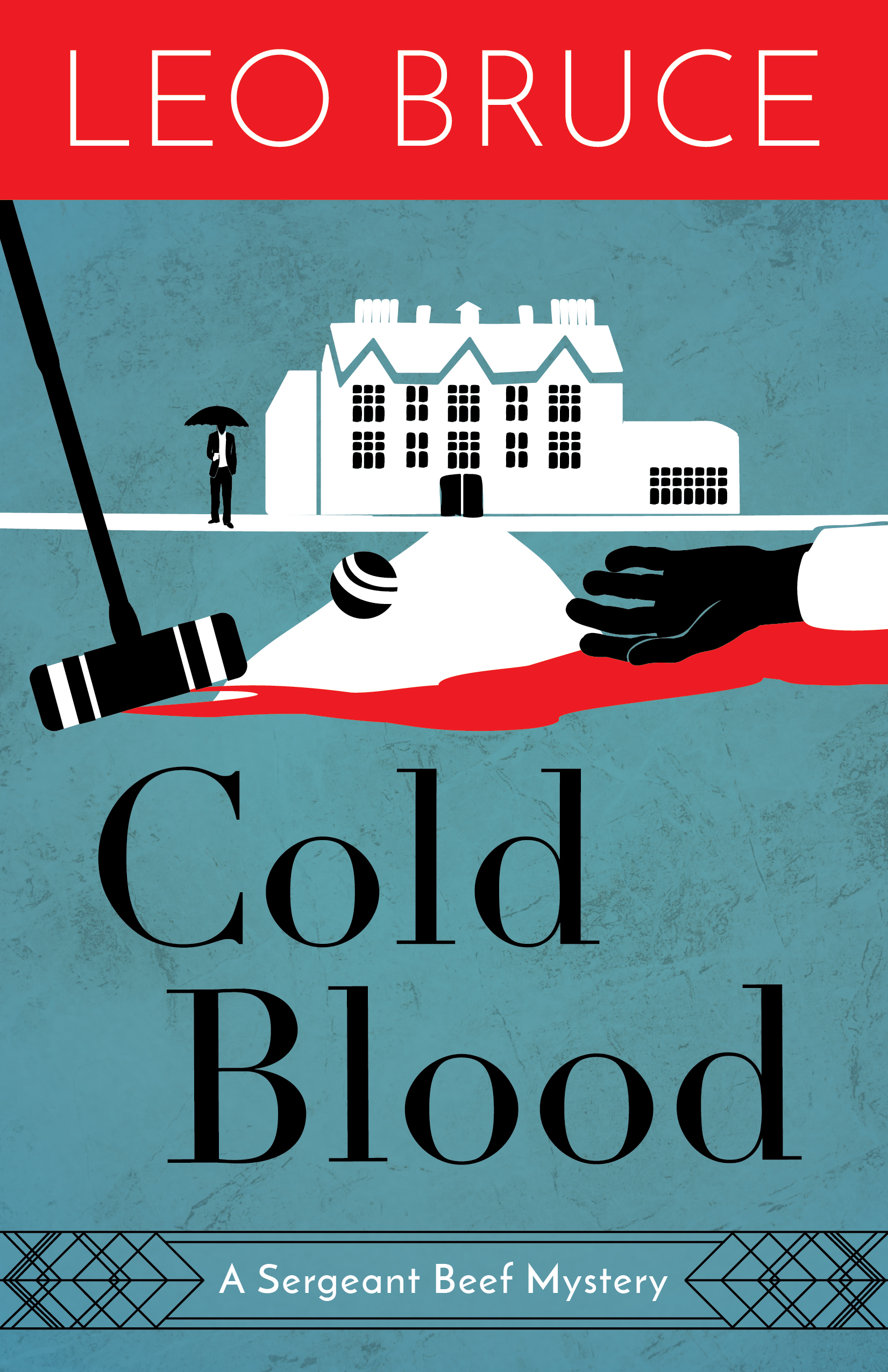
First up we have Lindsey Cleworth Schauer, an editor turned cover designer here at Chicago Review Press. Recently, Lindsey has created eye-catching covers for the Leo Bruce Sergeant Beef series, the newest revamp in the Rediscovered Classic catalog. Read below for an insightful interview on book cover designing!
What drew you to the art of book cover design?
Art was always a huge part of my life. My mom is a retired art teacher, and my grandfather is a retired advertising illustrator and painter. As I kid I used to draw all the time, and I did a lot of painting in high school. In college, I wanted to major in either art or English but opted for the latter because I loved the idea of being an editor and figured I couldn’t make a living as a painter. Later, as an editor at a DC-based book publisher, I would regularly peek into the designers’ suite to see the covers they were working on. It seemed like such a fun job. Book covers are marketing but also works of art in their own right. They can be so many things: abstract, literal, evocative, moody, bold. Covers are what get books faced out at shops, and every reader has bought at least one book solely because of the cover design. After years as an editor, I eventually decided I wanted to get in on that game and so, once I moved to Chicago, I enrolled at the School of the Art Institute of Chicago. And here I am!
What’s your process for designing books covers? What about these Leo Bruce covers in particular?
Covers at Chicago Review Press and its imprints begin with a brief from the acquisition editor that provides specs, direction, and usually comparable titles and covers for inspiration. I read the brief and highlight anything that seems especially important. Then I do my own cover research, writing notes and looking at various resources online to see if anything jumps out at me as a good direction to adapt.
Fiction covers are much easier to design when you’ve actually read at least some of the manuscript, so I read all or most of all three of these. This was especially useful for finding specific images and items important to the plots, planting red herrings, and avoiding spoilers. (I noted that someone on GoodReads had complained that the old cover of one of the titles gave too much away.)
The editor wanted illustrated covers. And since this is a series, I needed to come up with a design and illustration style that would be adaptable to multiple titles. I thought some simple silhouette scenes would work nicely to that end and with the period of the series. I also liked the idea of sticking to black, white, and two other colors only.
After researching and brainstorming, I usually sketch some rough thumbnails and then dive into digital illustration and layout.
Were there multiple drafts of these covers? If so, why did you ultimately decide to go in this direction?
These might actually be the only covers for which I didn’t provide wildly different options. I usually like to give an array of concepts, colors and type treatments rather than simply riff on the same idea. But since illustration is time consuming and I had a very clear idea of the right approach, these titles had three or four similar options each.
Cold Blood was the first cover I did in the series, and once everyone agreed on the right look, it was fairly easy to do the other two, since much of the layout was now static and I just had to come up with illustrations and color schemes.
What’s the most difficult aspect of cover design?
That’s tough to answer generally, since challenges vary from cover to cover. The most common challenge for me is finding ways to integrate what an editor wants with what I think would look best.
For this series specifically, the greatest challenge was probably conveying the right era without making the books themselves look old. Sometimes a design that hits a historical era too hard ends up looking dated. My hope is that these covers won’t age rapidly but will stay relevant for a long time, if not forever.
What’s your favorite cover you’ve designed so far?
So hard to choose! I’m really proud of a lot of my work. I love how Wally Funk’s Race for Space turned out. I had a great photo to work with, and I like that the type conveys “space age” and energy while still being crisp and modern. I had fun bringing elements of the front around to the back and flaps. Plus it’s a fun book, which is always a bonus.

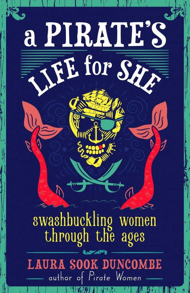
I’m also immensely proud of the forthcoming A Pirate’s Life for She cover, which was a rush job and a bit of a challenge for various reasons. I did all original illustrations and went through several concepts and iterations. I managed all this in a week or so, and I think it turned out pretty cool! I love taking books for or about women and creating covers that eschew typical feminine marketing stereotypes.
What do you think is the ideal recipe for a successful book cover?
It’s a complicated recipe and is similar to any successful design. Balance, typography, color, imagery—all these elements have to work together to convey the book’s subject and tone. It requires the right mix of clarity (What’s this book about?) and aesthetic appeal (Will it grab consumers’ attention?) and knowing when to sacrifice some of one for the other. You have to think about a book’s audience, consider the full cover design in addition to the front, and pay attention to trends. I am lucky enough to live close to an indie bookstore, Women and Children First, so I can regularly pop in to see what they’re displaying.
There are just so many decisions a designer has to make and variables to account for, which change from book to book. I never fully understood how challenging it can be until I got my hands dirty. But that’s what makes it such a satisfying job. There’s no better feeling than positive reactions to one of your designs.
1 Comment
Lindsey, I am a new author with SWP. You recently designed the cover for my book Homes with Heart: Turning Living Spaces into Loving Places. This is just to thank you for your work. It is both beautiful and eye catching. The book is a memoir with currents of self-help and spiritual reflection so it couldn’t have been easy to design. Thank-you for your good work. It is definitely eye-catching!